
Reviewed: Feb, 2023
Today, I want to share with you a little trick on how we can use Row Styles with aggregated values in Generic Inquiries. It’s not exactly obvious or intuitive how one might do this. From a cursory examination, it looks like the system doesn’t provide this functionality at all.
Let’s look at a scenario to illustrate this clearly. Say that we need to create a GI which will provide aggregated billable and non-billable time spent on the specific project by day which depending on the productivity (100*[billable time]/8, assuming that we work 8 hours per day) highlight the lines with different colors (green – productivity>=70, orange – productivity>=40 or red).
Building the Generic Inquiry
Let’s start building the GI by simply adding a PMTimeActivity and PMProject table.
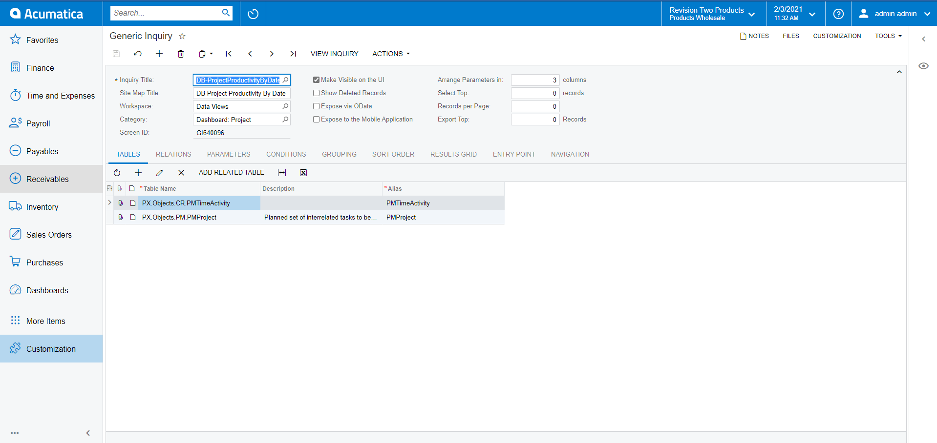
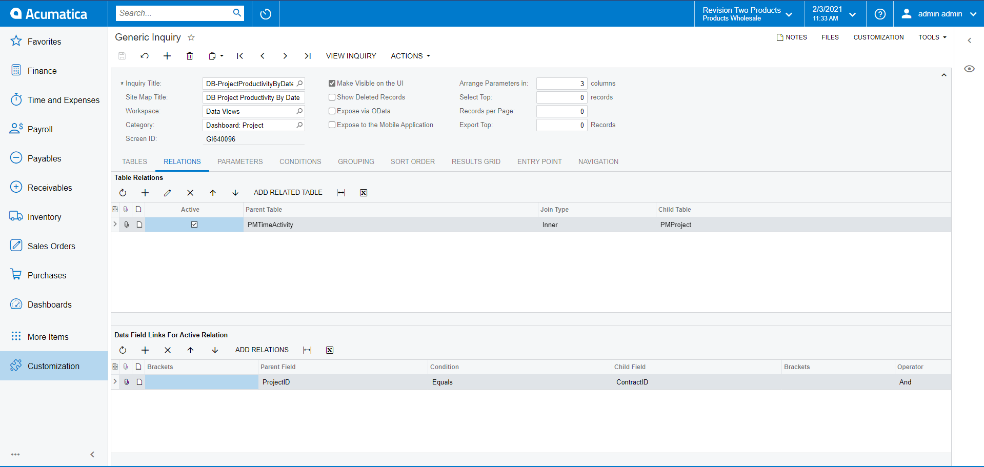
Now, let’s provide the Relations that are needed. We will do this with an inner join on Project ID as follows:
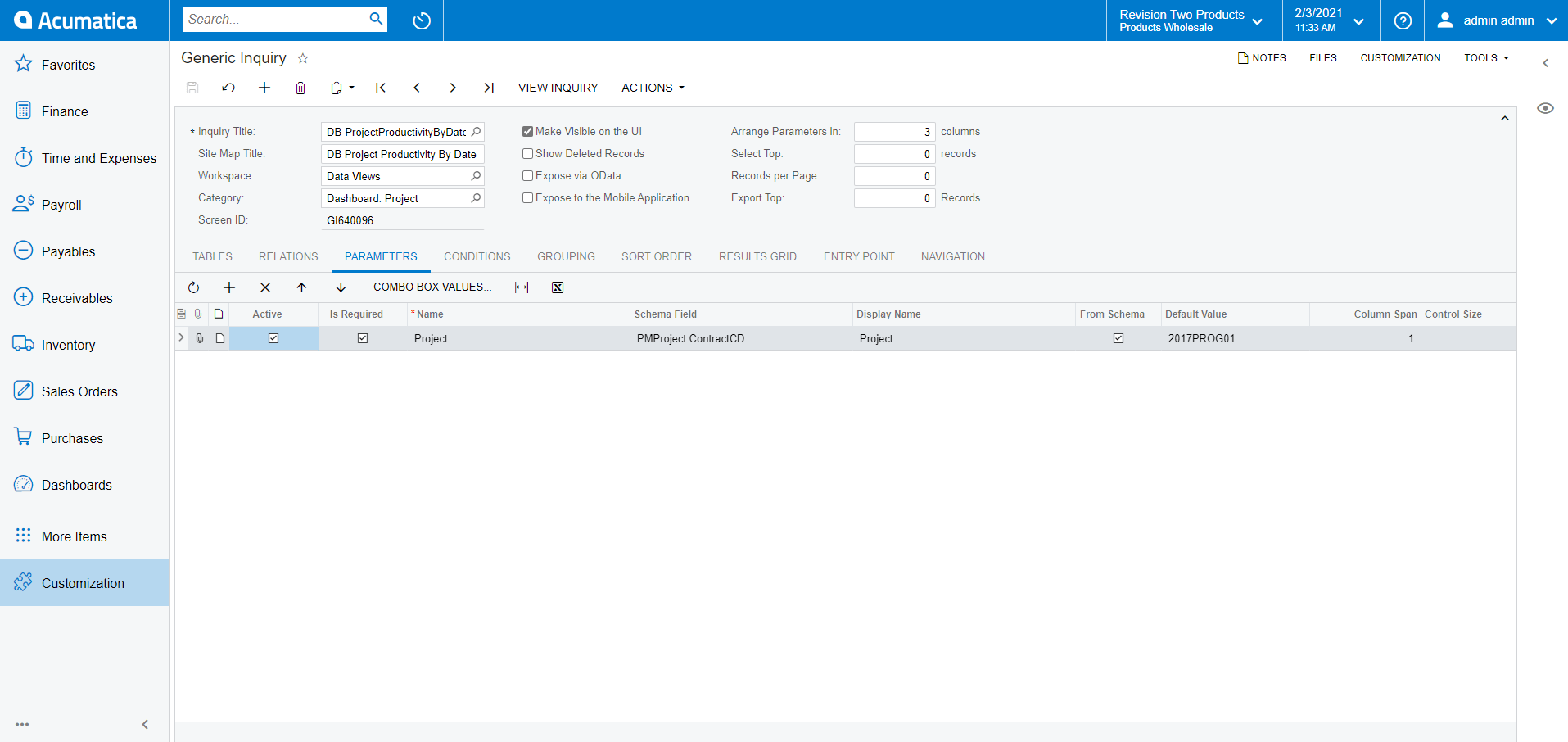
Next we need to add a parameter for Project CD so that we can decrease the result set to make it more readable.
Then we add a Grouping by Project ID for now. Acumatica allows us to get the result directly from the Generic Inquiry page by clicking on the Preview button (using the “eye” icon on the right panel). Now we can see the result without leaving the page.
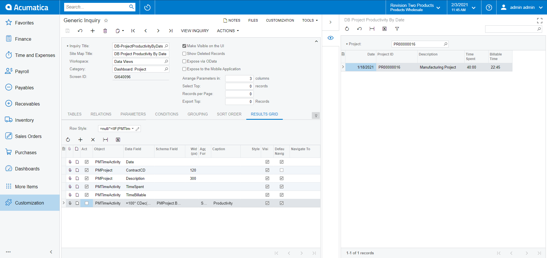
Grouping by Date
The next step we need to do is change the Grouping to group; also by the date.
Personally, I don’t like how the grouping works with Dates, therefore I use the below formula for grouping by Day=Year([PMTimeActivity.Date])*10000 +[PMTimeActivity.Date_Month]*100+[PMTimeActivity.Date_Day] which you can see in red below.
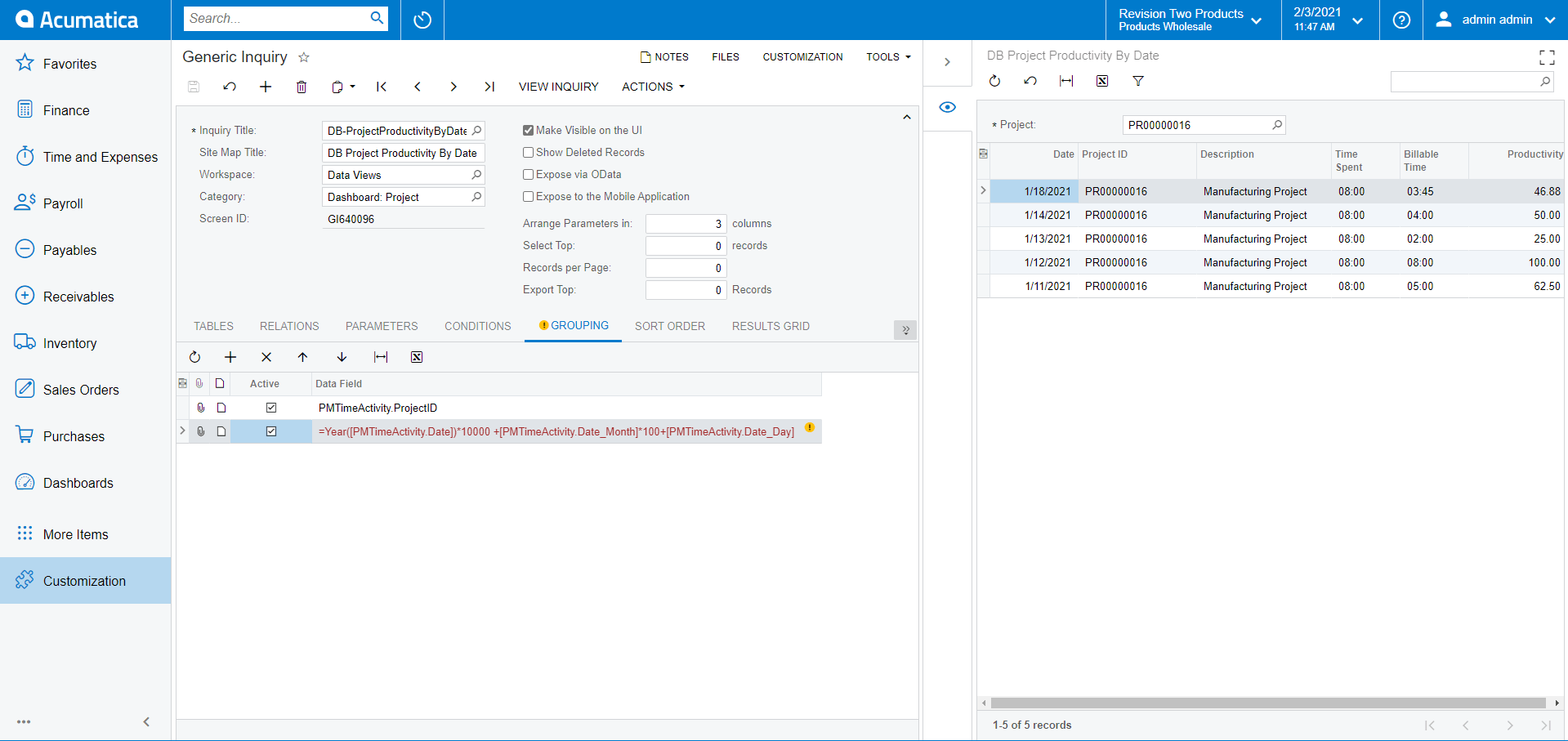
WARNING: This formula may not work correctly because of the Time Zone difference. Acumatica is keeping the dates in UTC.
Applying Row Styles
Now we will add some Row Styles. The formula we will be using is the following:
=IIF(100 * CDec([PMTimeActivity.TimeBillable]/60) / 8>=70,'good', IIF(100 * CDec([PMTimeActivity.TimeBillable]/60) / 8>=40, 'orange40','bad'))
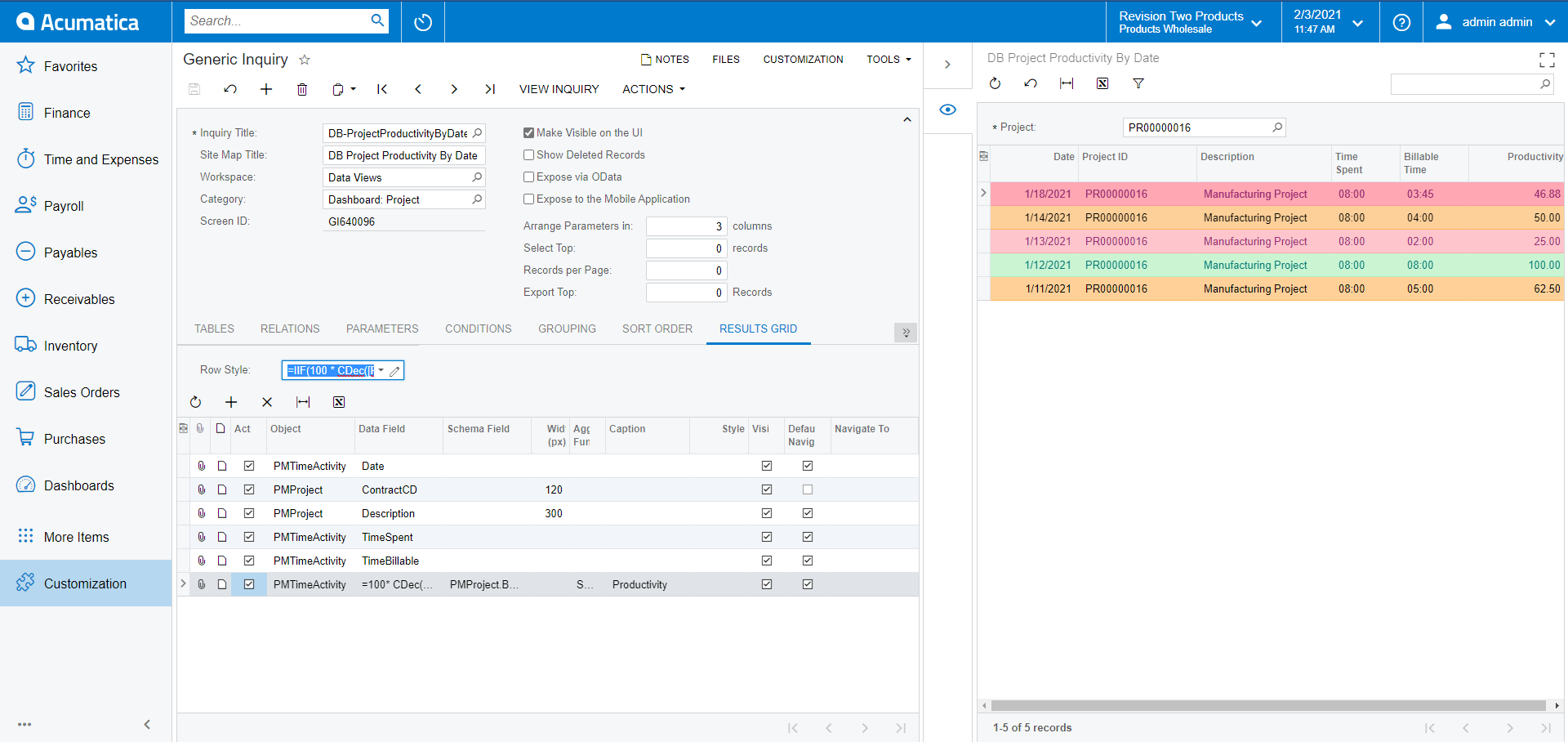
As you can see above in the screenshot, the Highlight didn’t work so well. The first line is highlighted in red, but the Productivity is >=40 which means it should be orange.
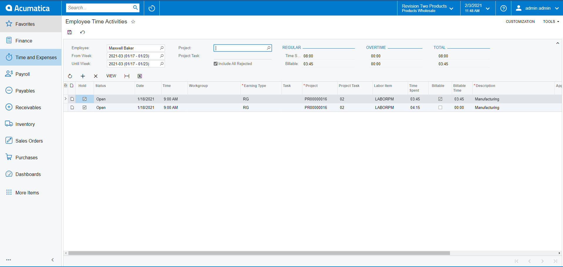
The problem here is because of the fact that the formula that we have provided is working without grouping and the calculation is taking the first time activity for that group, which in this case you can see below as 0 (zero) billable time in the second row of the Employee Time Activities listed.
Solving the Aggregation Issue
To solve this issue, we have to have a way to tell the Row Style that we want the value to be taken after the Grouping itself, although there is no documented way to do this at present. It’s not an intentionally hidden way to do it, however.
We simply need to use the following formula instead:
=IIF(PMTimeActivity_FormulaA4A7ACEFFCC1444DA018CE78DD1BFCA3>=70,'good', IIF(PMTimeActivity_FormulaA4A7ACEFFCC1444DA018CE78DD1BFCA3>=40, 'orange40','bad'))
As you may have noticed below, the line is now highlighted correctly.

Understanding the SQL Behind the Scenes
Let’s move on and analyze the SQL Scripts working behind the GI to understand why this formula worked and how. If we check the SQL Request Log, we will see the script below. As you can see from the screenshot, our formula for the Productivity column is being selected with an alias and it’s corresponding to the value that we used in the formula for the Row Style.
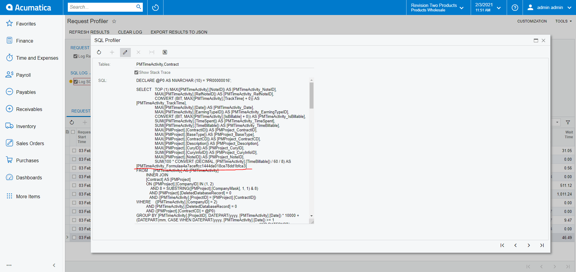
This is generated by the code below of the PXGenericInqGrph Graph:
GIST: https://tinyurl.com/msu6dx4b
And the GetExtFieldId method is basically just returning the RowID value.
GIST: https://tinyurl.com/msu6dx4b
Therefore, the code above is adding Formula and Row ID. Now let’s look at the Row ID of the GIResult for that particular line:

As you can see, the code is adding _FormulaA4A7ACEF-FCC-1444D-A018-CE78DD1BFCA3 to the Table Alias which is PMTimeActivity in this case and this is how the “PMTimeActivity_FormulaA4A7ACEF-FCC-1444D-A018-CE78DD1BFCA3” generated.
Here is the link to the GIST: https://tinyurl.com/yck94f5y
Hopefully, you have found this information useful in your own development work.
Happy coding!
 Canada (English)
 Colombia
 Caribbean and Puerto Rico
 Ecuador
 India
India
 Indonesia
 Ireland
 Malaysia
 Mexico
 Panama
 Peru
Peru
 Philippines
 Singapore
 South Africa
 Sri Lanka
 Thailand
 United Kingdom
 United States


